

HI-SEAS
Rebranding
Client:
Student Project at ArtCenter
Instructor:
Gerardo Herrera
HI-SEAS is a rebranding project for a NASA-supported space research program, focused on developing a cohesive visual identity system. The work includes logo design, typography, color strategy, and brand applications across digital and print platforms.
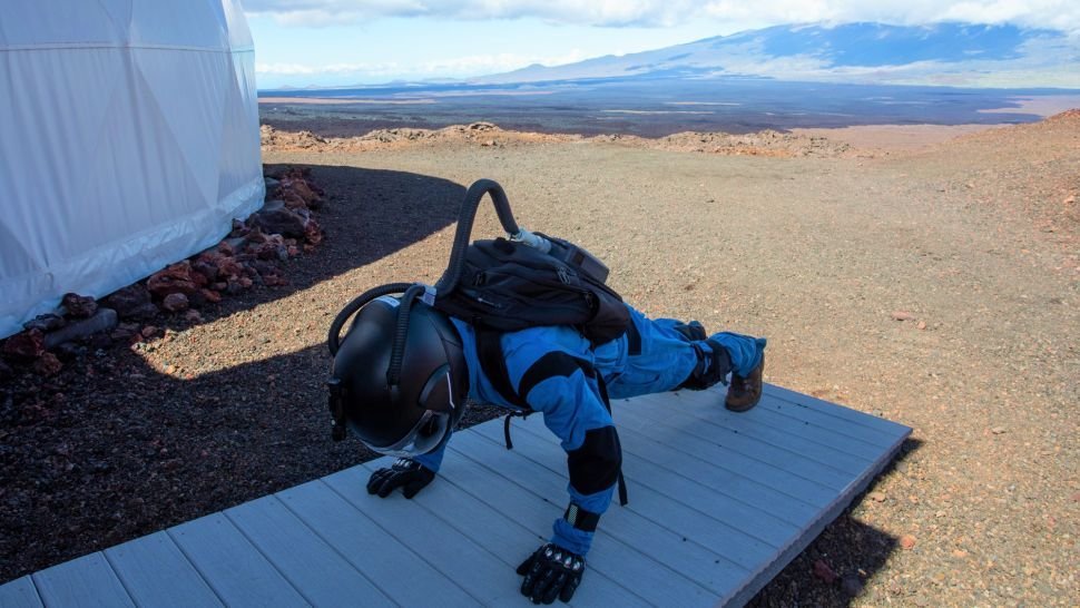

HI-SEAS stands for Hawai'i Space Exploration Analog and Simulation. It is a series of research missions conducted by the University of Hawai'i at Mānoa in collaboration with NASA to study the psychological and physiological effects of long-duration space exploration missions.
About HI-SEAS:

Monogram & Logo:

The logo uses a typeface which is geometric yet approachable. It represents the technology aspect as well as welcomes the new audience. Similary, the letter “A” is shaped to mimic the dome of the space station where scientists work.


Montserrat is a geometric sans-serif typeface. It’s high readability and ease of scaling makes it a suitable font for the brand. The colours of HI-SEAS are taken from the colours on Mars. The red and shades of brown represent the surface while the blue and yellow are scientist’s uniform.
Brand Identity:


Merchandise:

Stationary:


Web Design:


Livery:

The spatial design represents how HI-SEAS would set up it’s dome at a science museum to display its astonishing work.
Spatial:

Koisk:

Outdoor Poster Design:


